Learning Cert – Web Development
Overview
Learning Cert is a corporate, classroom, online, and self-paced certification training and skills optimization provider that aims to upskill individuals and keep organizations competitive. They offer courses in disciplines such as Governance, Service Management, Information Security, Continuity, Project Management, Digital Marketing, etc.
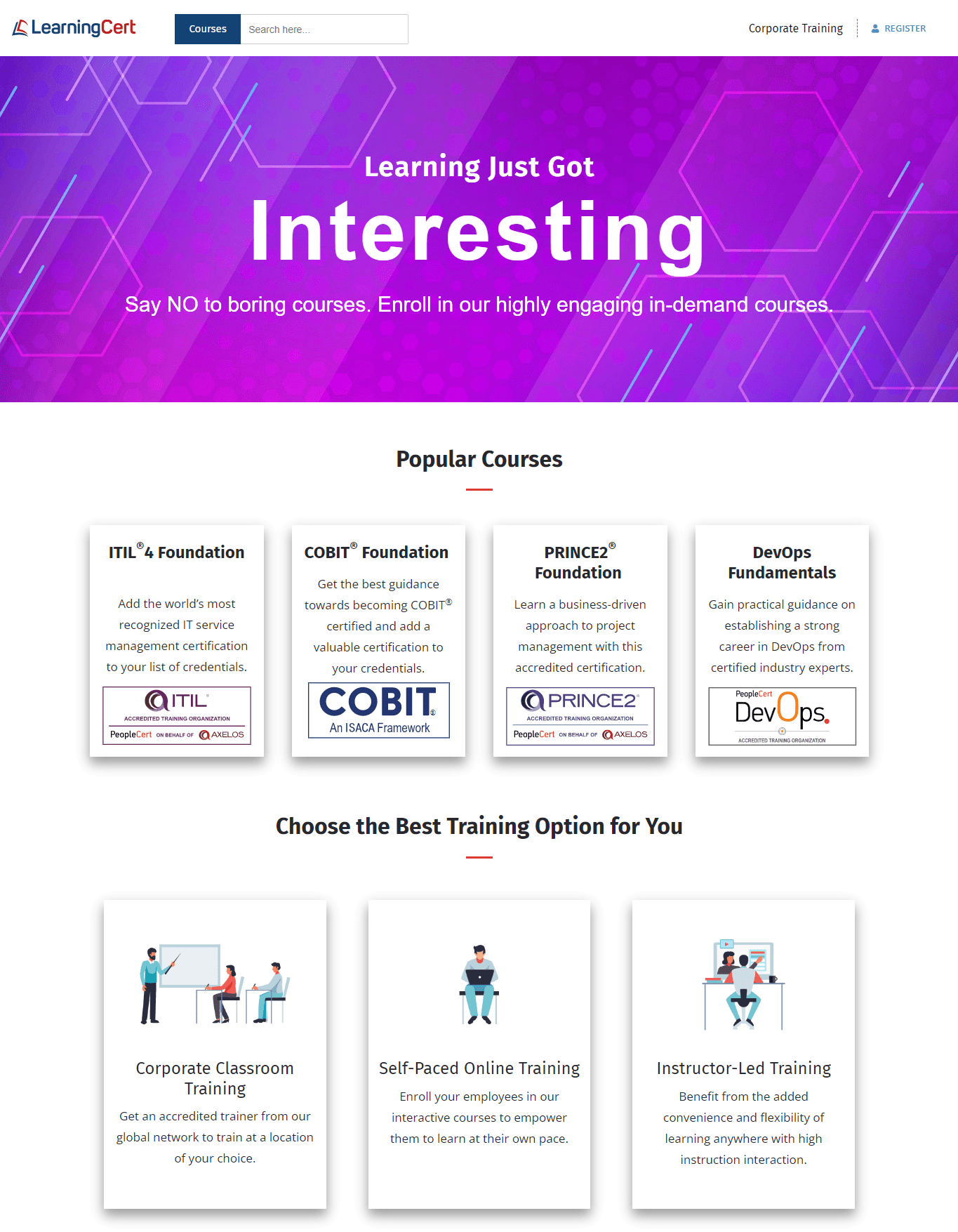
Case Summary:
The Learning Cert approached us for assistance with maintaining and improving their prior website. Unfortunately, it was designed on an out-of-date PHP framework that was causing them problems. We assisted them in making the necessary modifications, but it was like placing a bandaid on a bleeding wound - more significant changes were required.
So when they were ready to embark on an entire website overhaul and redevelopment, we were there to assist them.
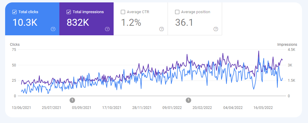
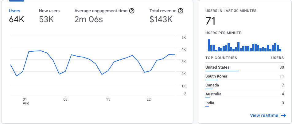
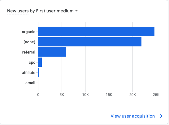
100% Fast Loading
91% Traffic Growth
20% ROI Increased
Challenge
Their current site was not only a jumble of code but also an unattractive one. Aside from the archaic appearance, the most common complaint we heard about the site was that it included a wealth of helpful information. Nonetheless, a lack of order and visual interest made it cluttered and difficult to browse. It was difficult for people to find what they were seeking unless they knew where they were going.
Solution
Analysis: We ran a thorough content and analytics audit to assess the existing state of the site's content and determine which content received the most traffic and interaction. To better understand what other course offerings companies were doing on their websites, we conducted a full competitive audit to discover what was and wasn't working for them.
UX Strategy: We were ready to begin developing the website's approach with our research and findings. We started our strategy by designing the website architecture. Because finding information was one of the most common stumbling blocks for website visitors, concentrating on this first made sense. Creating a sitemap that arranged the content regions of the site in a way that users could easily explore provided a solid foundation for everything else.
Build: After the strategy was established, the development finally proceeded. We had a great time designing the visual approach for the initial stage of the build. We wanted to add new life into the site's design, so we used a brighter, more lively blue with a complementary reddish accent hue against a white background. In addition, we used more comprehensive paragraph and headline sizing for better use to suit an audience with a wide variety of visual abilities.
Test & Launch: We had to verify that the site responded adequately to all device sizes and browsers so that everyone who visited it could quickly and easily get the information they needed. We launched the site online after a detailed launch plan assured we had everything lined up and ready to go.
Results
The site has been well-received since it went live. A modern, user-friendly website positions Learning Cert to fulfill better its purpose of providing people with a wealth of knowledge and courses.
From The Client
“These guys have built such a strong relationship with our organization that we consider them an extension of our IT department. We always know that excellent service is just a phone call or e-mail away and that we will receive the same level of attention they always provide that makes us feel like we're their top priority.”


